Harvest the sun! - Optimizing solar practicality across mainland US (Part 1)
Pre-ramble
Warning: This is a long-ish post where I walk through my thought process as I took this project from start to finish. For a quick summary of results, please read the section below and visit this page.
Note: This blog post reads like a Jupyter notebook, but it is powered by sagemath cells (had a field day integrating that with this blog). In particular, for a cell to execute, all prior cells need to be executed.
Setup & Background
So… I recently completed Google’s wonderful (online) data analytics professional certificate. Towards the end of this eight part course, I was required to do a capstone project employing all the tools and knowledge I have acquired over the course of the program. After looking around for some datasets online, I settled on a data set that I found on Google’s BigQuery database called Sunroof_solar. The project utilized google maps to survey rooftops in zip-codes across the US, to aggregate the potential for solar panel installation in that region. This immediately drew me in because:
- As someone hailing from a very tropical land and a culture that is tied closely to the sun,
- As someone with a strong inclination to be self sufficient and offset my own carbon footprint, and
- As someone who is finishing up school and moving into industry (hopefully in mainland US),
this dataset gave me a way to answer a very natural question – How do states in mainland US compare in terms of the practicality of solar panel installation in a median household? The hope being that I could potentially, one day in the far future, set my sails in that direction.
Caveats
How do we define practicality? Common sense says “go settle down in the areas with the most sun”, but there might very well be other factors at play. For instance, the proponsity to move to a state is dependent on the cost of living, and the propensity to install solar panels is dependent on the cost of installation, and the cost of electricity in those states. One could also track the total impact they might be having on the solar capacity of their state. For instance, in a state with fewer existing solar panels, a new installation would carry with it more bang than in a state where every other person invests in solar.
So to quantify and qualify “practicality”, we really do have to look at the data.
The model
Looking at the data
The columns contain a number of interesting quantities, which we utilize now to build a model (albeit, a bit naive).
Selecting relevant data
We see some obvious interesting candidates. Here are their descriptions from BigQuery:
- region_name: Zip code
- state_name: State
- percent_covered: % of buildings in Google Maps covered by Project Sunroof
- percent_qualified: % of buildings covered by Project Sunroof that are suitable for solar
- kw_median: kW of solar potential for the median building in that region (assuming 250 watts per panel)
- yearly_sunlight_kwh_median: kWh/kw/yr produced by solar installed on the median roof, in DC (not AC) terms
- carbon_offset_metric_tons: The potential carbon dioxide abatement of the solar capacity.
There are other interesting metrics there, however, either these are incomplete1 or these might get lost while we perform a statewide aggregates2. So we will simply work with these.
Building the model
Given these choices and our motivation, a reasonable goal is to create three trackable indices:
Impact index: Measures the impact (CO2 offset) a new installation has on the statewide solar output.
More precisely, it is the carbon offset as a percentage of how many potential qualified solar installations there could be in a said region.Economical index: Measures how economical and effective a solar panel installation is
More precisely, it is the average installation cost as a fraction of the average house price, taken away from the yearly solar kwh produced as a fraction of the yearly kwh consumed.Savings index: Measures the amount (in dollars) saved yearly in electric bills
More precisely, it is the difference between (yearly) costs incurred from kwh consumed and (yearly) costs saved via solar kwh produced in that region.
In addition, we will also create associated parameters with values in range [0,1] to go with each index. A user can modify these parameters to weight each index according to their preference.
To compute these quantities, we need to import some more relevant data, like state-wise solar panel costs, state-wide electricity consumption, state-wide average house prices etc. We will do that now.
Note: Here we are using pricing information that has been averaged across the state since this information was readily available for download. It was surprisingly hard to get pricing (or even demographic) information on a per zip-code basis. So, there is an inherent approximation that will permeate our final analysis coming from this state-wide average for any data point coming from the above data frames.
Cleaning the data
Cleaning solar data
After a cursory look through the data, we find some obvious issues that require cleaning.
The first obviuous bit of cleaning to do is to get rid of regions that are not a part of the mainland US. The additional 19 “states” reported by the data span only 32 data points, so removing them shouldn’t be an issue. The most concerning part of this exploration is that we have 4373 instances (~40% of our data) where the survey seemingly deemed a larger proportion of houses to be qualified for solar than the proportion it scanned. Since the link on BigQuery pointing to the data collection methodologies is unresponsive, we need to look into this further ourselves. But first, we will take care of the easier cleaning.
We isolate the regions that are not mainland US states.
Now we remove these, and also any occurrence of na’s. While we are at it, let us also create a new column that lists percent_covered to be a percentage of percent_qualified.
Finally, we set new column names that are easier to work with/understand
Now that we have taken care of the obvious cleaning, we will turn to our main concern to analyze the erroneous portion of data. To do this, we will first compute the number of data points we have for each state, and calculate the percentage of that data that is erroneous.
Now this is shaping to be a real issue. If the percentage of erroneous data was small, we could have considered statistical measures with a central tendency (eg. median) to avoid the extreme behavior. However, the percent of unclean data in a good selection of states is significantly high, and therefore keeping them around for analysis will skew our results for these states. So we are left to make the unfortunate decision of filtering these rows out of our dataset, and work with the remaning data.
Finally, after all this cleaning, we look at the states with the least amount of data available, if only, to remind ourselves to not take results for these regions very seriously until more reliable data is obtained.
Cleaning the other data
So I am not going to bore you with the details of similar (but comparitively) cleaning done to the other datasets. Instead I will leave annotated code below.
Analysis
State aggregates
I want to average values across an entire state (as opposed to treating this problem zipcode by zipcode). The first main reason is because that is inherently the question I want to answer. The second reason is because my moneys dataframe contains quantities that have been averaged across the entire state.
So, let us check to see the standard deviation of the kw data to see if it is reasonable to average across the entire state. Let’s see what the standard deviation of the kw_per_house value is across the entire state, and report the worst ones higher up. A higher standard deviation would tell us that there is considerable variability in the solar panel output between various zipcodes.
That is some pretty high standard deviation for kw per house. A quick search says a single panel produces ~1.5-2.5 kWh/day. Let’s say, that times max 20 panels per house, that’s max production cap of 50kWh. Scaling to a year, we can produce a theoretical maximum of ~18000kWh/year. So we estimate some more realistic numbers for kw potential. Let’s look at some outliers.
Aha! looking up a few of these zip codes informs us that all these instances belong to either dedicated solar farms or some big establishment like big malls/shopping complexes that have solar panels installed onto their roofs. Below are some examples. This could be an artifact of the data collection process where they looked at existing solar installation in a zipcode and extrapolated it to the entire region. In particular, we can conveniently ignore these data points, which there is another 500 of.


Once again, before choosing to filter them away we do a similar analysis to before. First we will focus on the total kw_potential for a median household.
Just focusing on the percent_abnormal_kw_pot, we see that for some states, these abnormal data points make up about 20-25% of data (per state) that we have, so even using measures that have some central tendency, we might still be unable to produce a faithful representation of the true underlying data. On the other hand, the number of abnormal cases is not that terrible compared to the losses we have already incurred in the previous cleaning step. So we might as well get rid of these points as well.
Now, we focus on the yearly kWH produced by the median household.
Now, we can see some patterns and stories emerging from the data. We are able to see the first glimpse of our answer in the above table! Consider the top candidate Arizona. About 85% of its yearly kwh production is flagged abnormal by our average standards, even though the solar kwh potential per median house is flagged as being perfectly normal. So, this is saying that, a typical house in Arizona has exactly the number of solar panels and the kind of solar installation we are looking for, but is generating what is considered an abnormal amount of solar energy, compared to the national average. So, Arizona should be one of the top contenders for our final answer!
Now as a secondary check to see if we can average across the state, let’s compute the standard deviation of both quantities to see how much variability we observe across the state.
So in terms of kw_potential for a median house, we arre doing really well. We have successfully eliminated all bigger entities like solar farms and big malls that were skewing our data. However, the yearly_kwh_produced still has big variability within a state. Let us see some examples to observe if there are major outliers causing this.
So from the plots we observe that the all states except Michigan have bad standard deviations from a lack of data points or a few outliers in the case of Washington DC. Michigan, is well, Michigan. In any case, since the most of the worst preformers arise from a lack of data, we don’t need to filter them out any further. At the same time, since we do not want the outliers to skew our analysis, for our global state by state analysis, we will only consider the median kwh output for all data points in that state.
Finally we perform a similar analysis on carbon offset, which yields similar results. For the sake of getting to the end of the post already, I skip code from this part of the analysis. This portion of the analysis can be found in my Github code. With this, we finally, compile all the relevant medians (aggregated by state) into a new data frame.
Building the state model
With the data validated and cleaned, we are now ready to throw this into our model and see what it spits out. First we merge all the relevant datasets.
And we also create scalable weights for our indices.
Finally, modify our main dataframe with the indices, create a ranking system and output it all to a .csv file.
Building the zip model
Now that the zip-code based data is clean, we can also get a more coarse representation of model by just directly looking at our indices at each zip-code for which we have data available. Doing this is a relatively straight forward process. The only thing we need to change is that in the previous case our “number_of_customers” came from a state-wide average. But now, we replace that with the count_qualified data field included in the original solar data from google. The rest of the variables can stay as they are.
Now, we finally build our model on a per-zip-code basis
Results
To visualize the results of this undertaking, I used tableau to quantify my findings. Below is the Tableau dashboard.
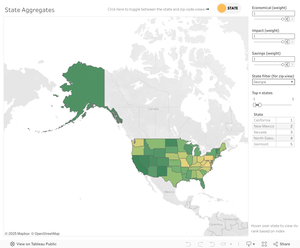
In the state aggregates tab, we obtain the answer to our initial question. The top five states with optimized solar practicality (with each index weighted equally), are drum roll
- California
- New Mexico
- Nevada
- North Dakota (Was in our blacklist for a lack of data. Take this with a grain of salt)
- Vermont (Was in our blacklist for a lack of data. Take this with a grain of salt).
Next contenders to replace 4 and 5 are
- Utah.
- Rhode Island. (HUH? Probably because it is a small state, but HUH!)
Is this the end?
Probably not. I am currently mentoring my DRP student on the universal approximation theorem, which is the backbone that allows deep neural networks to be as powerful as they have turned out to be in this day and age. One potential project for this student is to train a deep neural network on the current dataset used in this project, and use it to predict the relevant indices at zipcodes that we currently do not posses the data for. I will update the blog with a part 2, once we end up building such a model.
Exciting times.
Thank you for taking the time to read this. Here is a complementary meme.