Topological Data Analysis - Part 3 - Building a topological classifier.
Recap and introduction
In Part 1 of this post we developed the notion of a simplicial complex - which is a shape built out of triangles (and their higher dimensional analogues), and we gave a theoretical overview of how to construct the barcode of a simplicial complex - which boils down to doing some linear algebra over the field $\mathbb{F}_2$. The barcode (via homologies) of a simplicial complex gives a way to capture the topological data of the complex. In Part 2 we took this abstract construction and made it more applicable - by illustrating various ways to construct simplicial complexes out of a given point cloud $\mathcal{X}$ thereby giving us access to the notion of a barcode associated to a point cloud $\mathcal{X}$. This ultimately captures the topological datum of $\mathcal{X}$. In this last and final part, we will put parts 1 and 2 in action by building a random forest classifier that classifies point clouds $\mathcal{X}$ sampled from various shapes in $\mathbb{R}^3$ based on their topological features.
Before we get to the implementation, we need to develop a few other tools that are going to translate our barcodes into vectorized objects that retain the topological information that could be fed into a classical machine learning classifier like the random forest classifier.
Persistence diagrams
Recall from Part 1 that a barcode is a collection of $\mathcal{P}-$intervals $(i,j)$ corresponding to the lifetime of a certain topological feature as we progress through the simplicial filtration. In this section we introduce an equivalent notion of a persistence barcode, which is a persistence diagram.
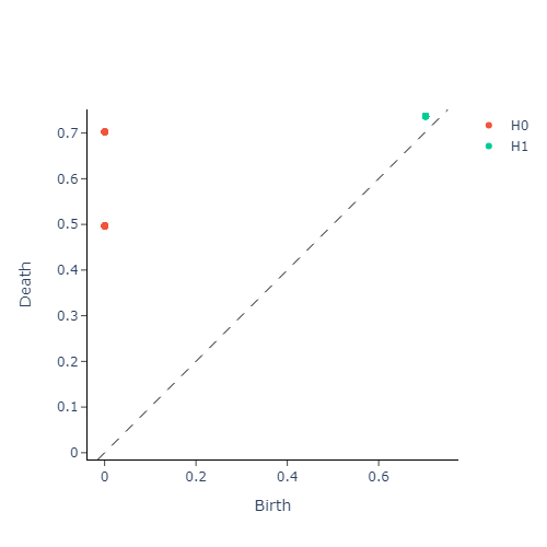
Definition: A $\mathcal{P}-$interval $(i,j)$ found in a persistence barcode, can be interpreted as a point on the half-plane defined by the inequality $x\leq y$ and vice versa. Thus every interval present in a barcode corresponds uniquely to a point in this half-plane. This alternate interpretation yields the persistence diagram of a filtered simplicial complex $\Delta$.
The following diagram illustrates these equivalent representations side-by-side for a simplicial complex built out of a point-cloud sampled from a torus:
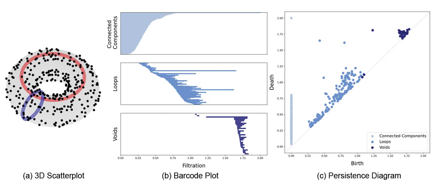
Just like the length a $\mathcal{P}-$interval in a barcode indicates how strong a topological feature persists, the strength of persistence in a persistence diagram is given by the (vertical) distance of a point $(x,y)$ away from the diagonal $x=y$
Vectorizing persistence diagrams
Although persistence barcodes (or equivalently, diagrams) are useful in displaying homological information - they can not be used directly in data science or machine learning applications. For instance, there is not a well-defined way to perform algebra on persistence diagrams. As such, there is a need to “vectorize” the information contained in these persistence barcodes. Many methods have been introduced to solve this issue. Some notable ones include convolving the diagram with a kernel function to produce a heat-map of the persistence information, while another approach introduces the notion of a “persistence landscape”, which is a family of $L^p$ functions that extract the persistence information from a persistence diagram. In our particular application, we will introduce a much simpler way to vectorize our persistence diagrams via what is known as persistence entropy. Intuitively, this takes the persistence diagram in each homology dimension, and produces a number that quantifies how far away it is from having no homology in that dimension. More precisely,
Definition: Given a persistence diagram as a collection $D = {(b_i, d_i)}_{i\in I}$ with $b_i < d_i < \infty$, the persistence entropy of $D$ is defined as
$$E(D) = -\sum_{i\in I} p_i\log(p_i), \qquad \text{ where } p_i = \frac{d_i-b_i}{L_D} \text{ and } L_D = \sum_{i \in I} d_i-b_i$$
With this, we are ready to jump into our application
Building the classifer pipeline
Note: The code for the implementation can be found in this jupyter notebook.
We will use the python library Giotto-tda to develop a topological machine learning pipeline that will classify point clouds sampled from various shapes in $\mathbb{R}^3$. For the first part of the application, we will train and test the classifier on synthetic data and measure baseline performance. The synthetic point clouds will be sampled from four different shape classes:
- A circle, posing a strong homology in dims 0, 1 and no dim 2 homology (i.e, $\beta_\mathcal{X} = [1,1,0]$)
- A Sphere, posing a strong homology in dims 0, 2 and no dim 1 homology (i.e, $\beta_\mathcal{X} = [1,0,1]$)
- A Torus, posing a strong homology in dims 0, 2 and two strong dim 1 homologies (i.e, $\beta_\mathcal{X} = [1,2,1]$)
- A Plane, posing a strong homology in dim 0, and no dim 1,2 homologies. (i.e, $\beta_\mathcal{X} = [1,0,0]$)
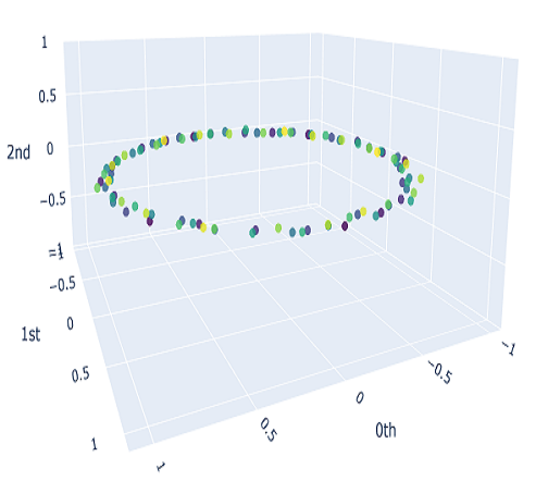
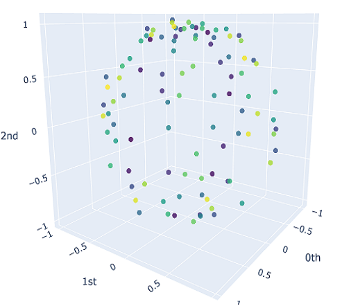
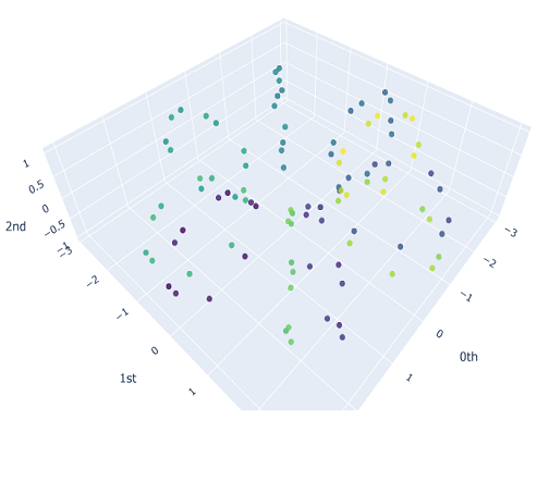
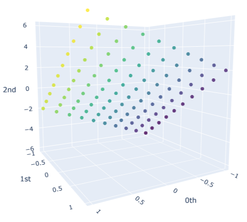
We will sample $10$ different point clouds for each shape class (sampled with some uniform noise away from the shape), and each point cloud will be made up of $100$ points. Thus, our raw data is a tensor of shape $40\times 100 \times 3$. Here’s a sample of how each of our point clouds look:
We then construct the VietorisRips complex associated to each point cloud, and use it to generate it’s persistence diagram. This part is neatly packaged into a single function $\texttt{get_diagrams}$ in Giotto. Shown below are the generated persistence diagram for each of the shapes illustrated above:
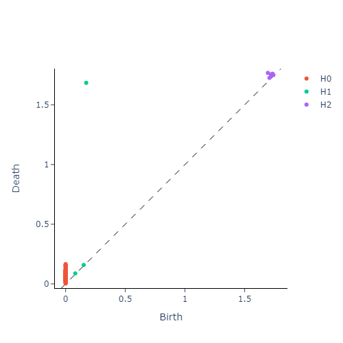
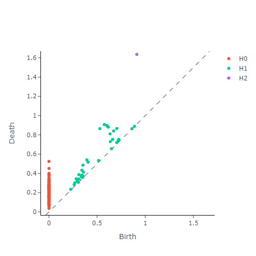
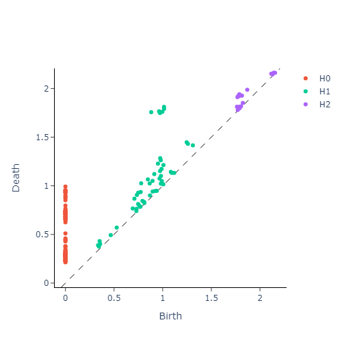
We see that the circle poses a strong dimension 1 homology, whereas a sphere produces a strong dimension 2 homology. We also see that the Torus exhibits multiple strong dimension 1 homologies, and finally the plane has no significant homologies present in dimensions greater than 0. We will capture this observation mathematically via calling the entropy function on each of our persistence diagram. This gives us three numbers for each persistence diagram, with each number corresponding to the entropy in a homology dimension. Since we only compute up to dimension $2$ homologies, we can conveniently plot the entropies as points in $\mathbb{R}^3$. The plot is presented in figure below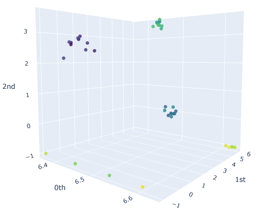
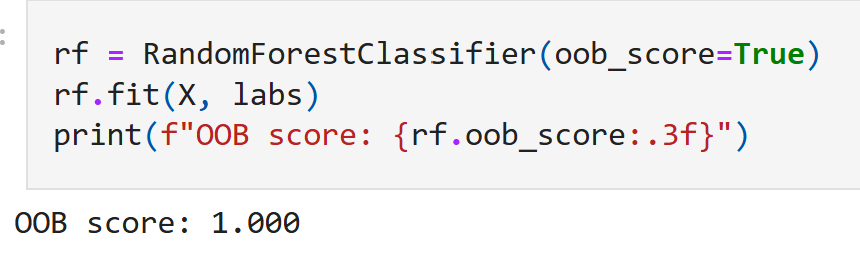
We can see that there are clearly four families of points, each corresponding to a different shape in our initial point cloud data. Having successfully vectorized our persistence diagrams, we could use any of the various classifiers present in a robust machine learning package like scipy. In this case, since we can already visually confirm the presence of clusters, we can use something like the $\texttt{RandomForestClassifier}$ that is robust for such clustering problems.
Important upshot: The input to our classifier now is just 3 dimensional as opposed to 300 dimensional, had we fed in the entire point cloud with 100 points each with 3 numbers quantifying the x,y and z values! This is a substantial reduction of the input feature size from $300$ to just $3$ - an improvement by a factor of $d/N << 1$!
In addition to just substantial reduction of input feature size, we note that in this synthetic case, upon training we obtain convergence of our model with a ‘out-of-bag’ validation accuracy of 100%.
Pitting our classifier against real life data
Having seen considerable success in the toy model, we will test our classifier against real life point-cloud data obtained from here. This dataset is freely available via the $\texttt{get_dataset}$ function in the openml library. The data file contains 40 different point clouds across 4 classes (i.e, 10 clouds per class), each with 400 points.
For each of these point clouds, we once again build a VietorisRips Complex, generate persistence diagrams and compute the persistence entropy for each point cloud $\mathcal{X}$. This gives us a $400 \times 3$ input entropy matrix that we will use as features for our classifier. Like before, we also plot the entropies just to visually ascertain the presence of clusters:
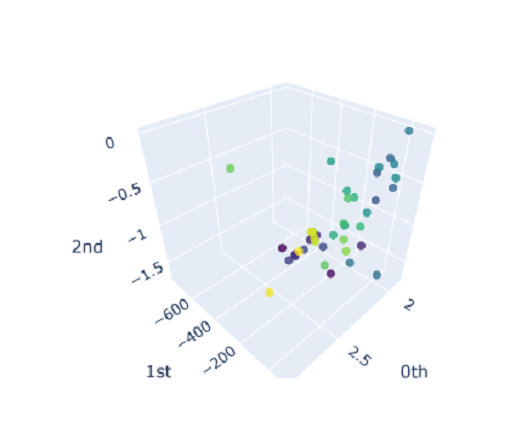
and we observe no nice clusters. This is expected out of real world data that doesn’t have just a single prominent topological feature. So we should expect our model to not perform very well; which is indeed the case:
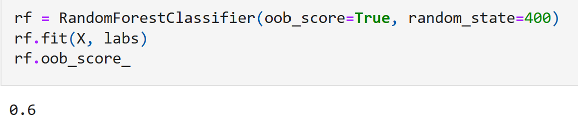
Although 60% does not sound very impressive, it is worth noting that with four shape classes - just random guessing will only give an $\texttt{oob_score}$ of just 0.25.
Improving our model
Note that the above model has effectively improved the input feature size from $N$ to just $3$, but this came at a price of sacrificing performance. So, one way to improve our model is to extract more topological quantifiers, and their vectorized versions as additional inputs to our classifier. For instance by only using the $\texttt{PersistenceEntropy}$ to classify our shapes, we are averaging out the distribution of points on the persistence diagram which might hold important information - for instance, the number of off-diagonal points in our persistence diagrams could be a great predictor of how clean our homology is, which is bound to change between different classes (and thus might be a good predictor). In addition to persistence entropy, we can also have other measures of “amplitudes” that detect how far away a given persistence diagram is from the trivial persistence diagram (of the empty-set, where no homological information is observed in any dimension). Giotto comes built in with various standard amplitudes that are considered industry standard. Each of these amplitude will contribute to three new features (one for each homology dimension) that could potentially improve our classifier.
We will package all these additional new features along with our persistence entropy into a pipeline and fit a RandomForest classifier to this new feature union. Including all these new metrics as features in our classifier, we end up with a model that takes $21$ input values, which is still considerably smaller than $300$.
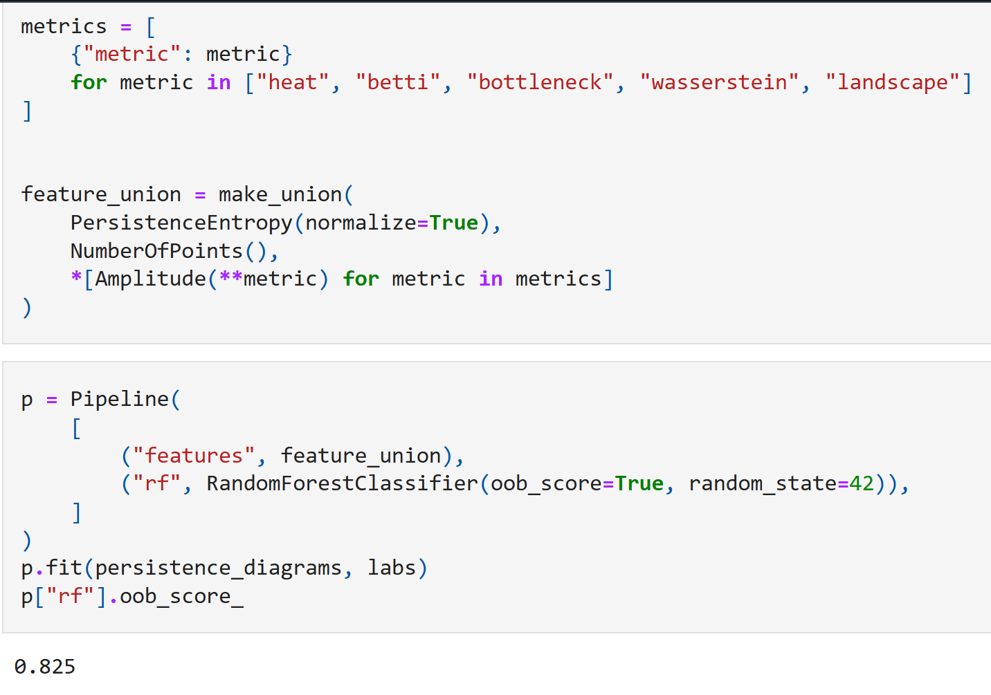
As expected, the model does considerably better here, with an out-of-bag accuracy of 82.5%! We can now also rank the relative importance of each of the above topological features. This produces the following chart:
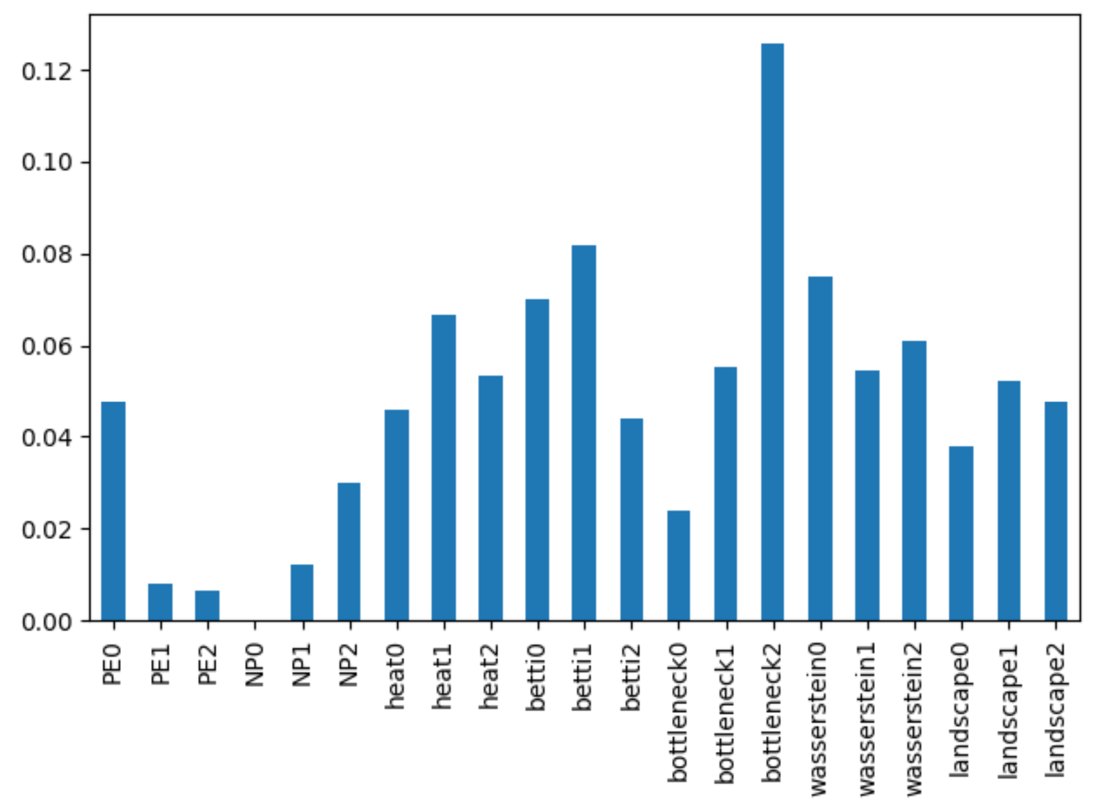
From here it looks like the most prominent predictors turn out to be
- Bottleneck distance in dimension 2,
- The betti amplitude in dimension 1, and
- The Wasserstein metric in dimension 0
where the Wasserstein metric behaves comparably to the betti amplitude in dimension 0 and the heat (homology contour) map in dimension 0.
That is all for this data exploration – Thank you for sticking around! Here is a congratulatory meme for making it through.